First Update
The website began development quite a few months ago. However, lack of time has meant that it has developed very slowly. In the initial few months I had to get to grips with CSS formatting techniques.
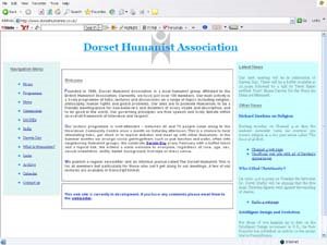
Moreover, the obstacle which needed to be overcome was the layout of the page. It was felt that it would be best to have the menu running along the left-hand side of the page. In the initial stages I experimented with some CSS style techniques found on the web. The image below shows the site as it was initially:

Nevertheless, this layout seemed rather cluttered, and proved hard to extract information from. After a long time trying to develop a better, and more compliant layout. I had many problems trying to find a layout which works properly in Internet Explorer, Firefox and other explorers.
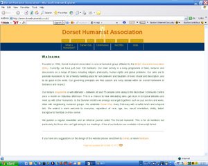
Alas, I decided not to procrastinate any longer and develop the website I had in mind, which is not as compatible with Firefox as I hoped. I like the new layout because it offers a more accessible layout which presents a main text a lot more clearly. The image below shows the site as it is now:

With the text spaced out the website is much easier to read. In my next post I will go into more detail into the structure of the website, and how it will be changing further. One problem, as I have said is encountered in Firefox, where the menus do not display properly. The picture below shows this:


No comments:
Post a Comment